
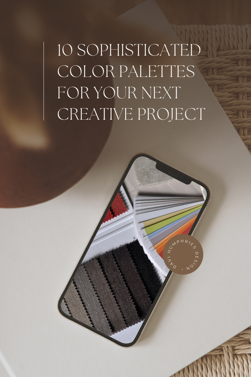
10 Sophisticated Color Palettes for Your Next Creative Project (with hex codes)
The color palette you choose has a significant impact on the way your brand (and messaging) is received by your audience. Individual colors often evoke specific emotions and certain color pairings can create an entire vibe that just one color alone may not have achieved. In other words, your color palette starts subconsciously communicating with your audience before they’ve read a single word of your copywriting.
In this article, I’m sharing some examples of how color affects your brand, my process for creating website color palettes, and 10 web-optimized color palettes I’ve created for you to use on your next creative project.
With each palette, I’ll discuss the associated color theory along with brand adjectives I listen for when clients are describing their ideal brand. Plus, I’ve provide the hex codes for each color so you can quickly and easily pick these palettes up and run wild with them.
Find this article helpful? Pin it for later!
Real-World Color Palette Examples
Below are 3 mood boards I recently presented to a client of mine that all use the exact same logo (she already had one that she loved and didn’t want a new one) and photos from the exact same shoot. However, all three of these color palettes evoke different emotions and have a completely different feel from each other.
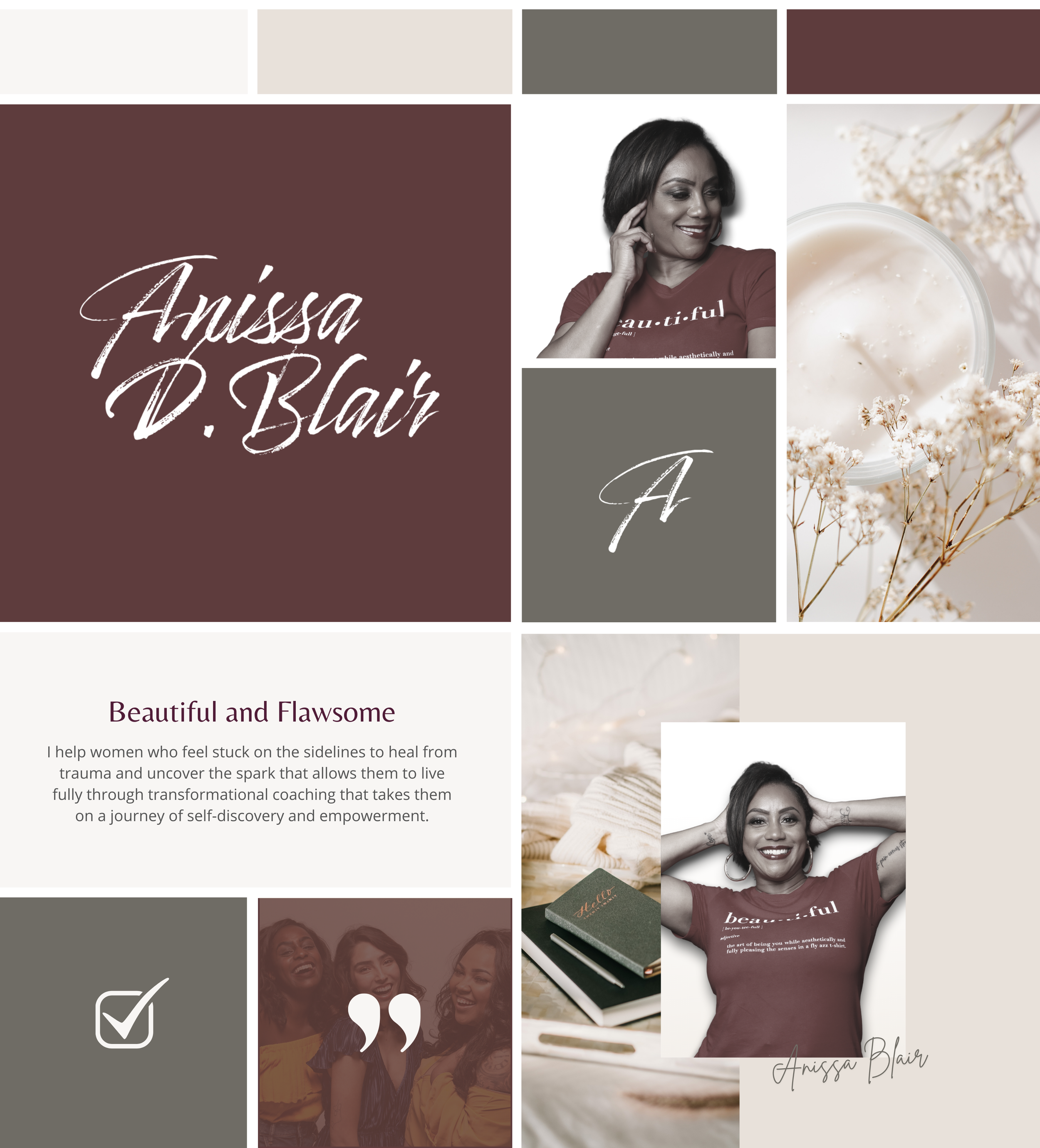
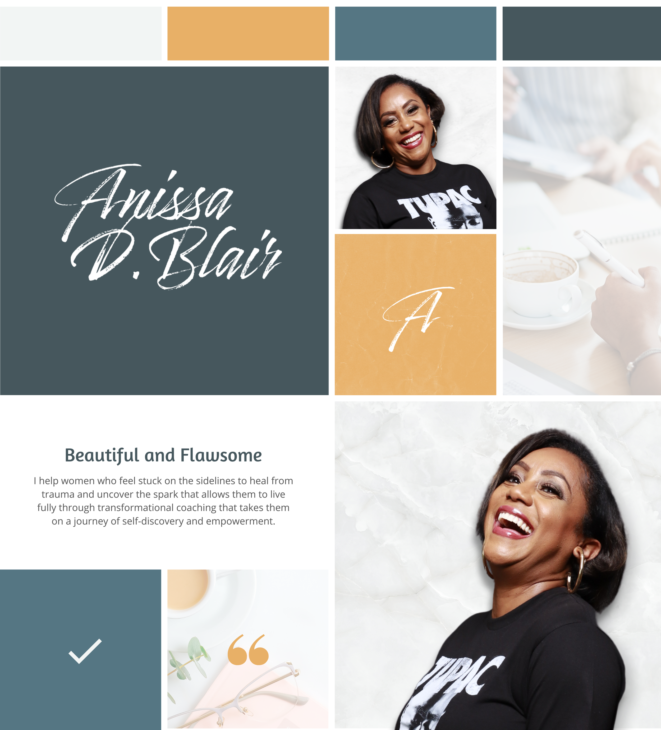
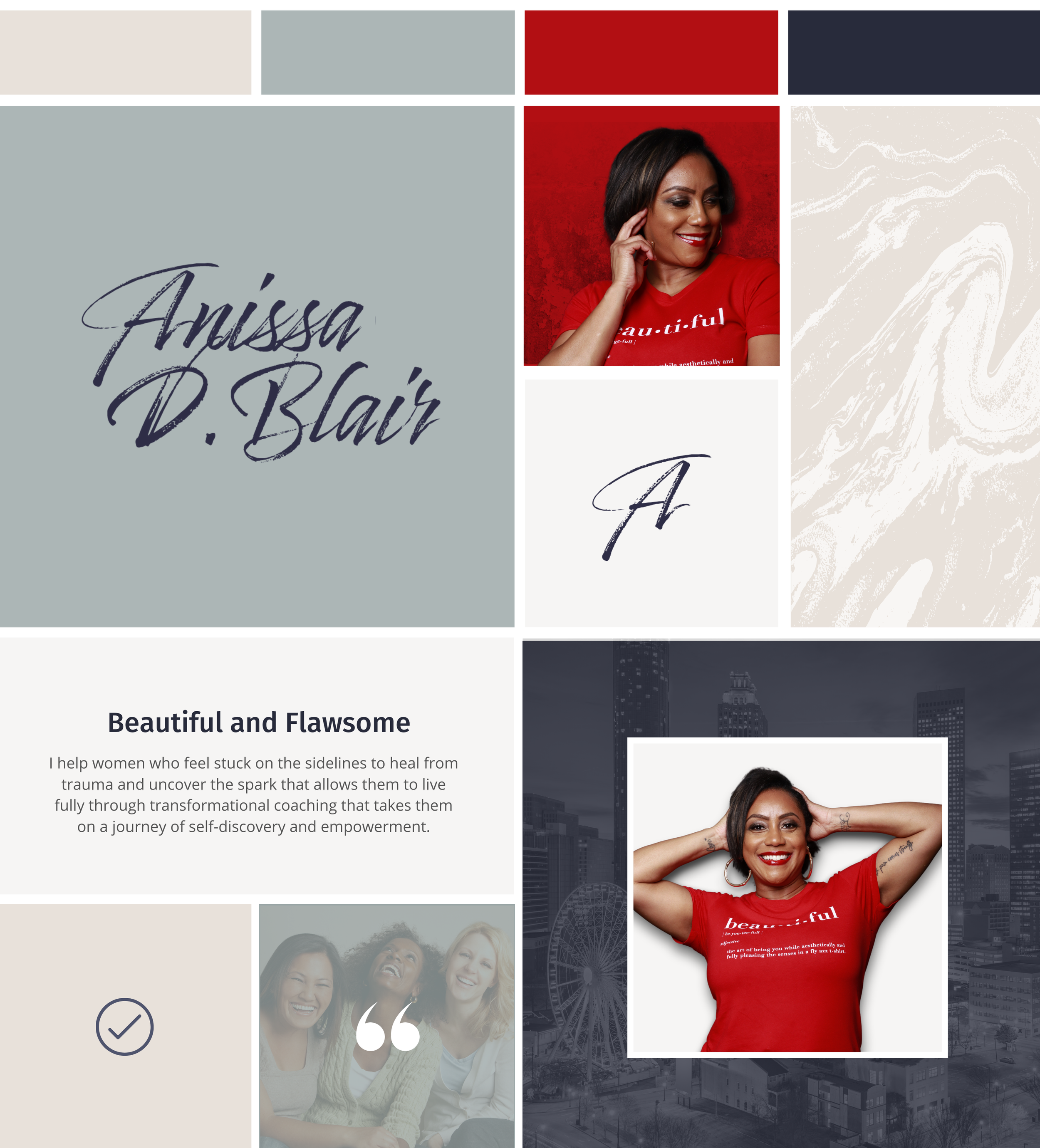
You’ll notice that I’ve also included different patterns and textures to support each color palette and brand direction, but without even looking at the details of each of these mood boards, the color palettes themselves strike you first and set the tone.
My Process for Creating a Website Color Palette
When I create a color palette for a custom brand or website design project, I typically like to start with 1-2 core colors and then fill the palette out with similar or complementary shades and tones that I can use in different ways across the project.
Typically, I end up with 2 darker colors, 2 bold accent colors, and 2 lighter colors. I like the darkest and lightest colors to both be relatively neutral - staying in the almost-black and almost-white range, and then I tone them warmer or cooler to complement the rest of the palette. In any palette, I like to select one color that is the brightest, boldest, or most saturated. This makes it easy to create a brand that’s consistent while still allowing for flexibility.
10 Color Palette Ideas for Your Website (+ hex codes)
Take a look at the color palettes below and see if you recognize these patterns. As with all of my web-optimized palettes, I’ve specially selected these colors so that they show up well on screens, are toned down enough that you can easily read text that’s placed on top of them, but they still have enough saturation to make sure they’re packed full of personality.
1. Earthy Color Palette
This Earthy palette is a complementary color scheme that provides an earthy vibe with subtle, neutral, grounded hues and a holistic blend of sage green tones with shades of brown. Green represents growth, serenity, and calmness. Brown is associated with resilience, dependability, security, and safety.
Brand adjectives: earthy, warm, approachable

2. Frosted Color Palette
This Frosted palette is a monochromatic color scheme with varying tones of blue and grey. Green often represents growth, serenity, and calmness. Brown can be associated with resilience, dependability, security, and safety.
Brand adjectives: cool, clean, minimal

3. Sensual Color Palette
This Sensual Palette is a monochromatic color scheme with warm shades of brown, pink, burgundy, and black. Red represents energy, passion, and strength. Brown is associated with resilience, dependability, security, and safety. Black is often symbolic of mystery, power, elegance, and sophistication.
Brand adjectives: bold, elegant, upscale

4. Fresh Color Palette
This Fresh Palette is fun yet classic with shades of blue, green, and brown. Green often represents growth, serenity, and calmness. Brown can be associated with resilience, dependability, security, and safety. The blue lends an air of calmness, serenity, and strength.
Brand adjectives: classic, fresh, grounded

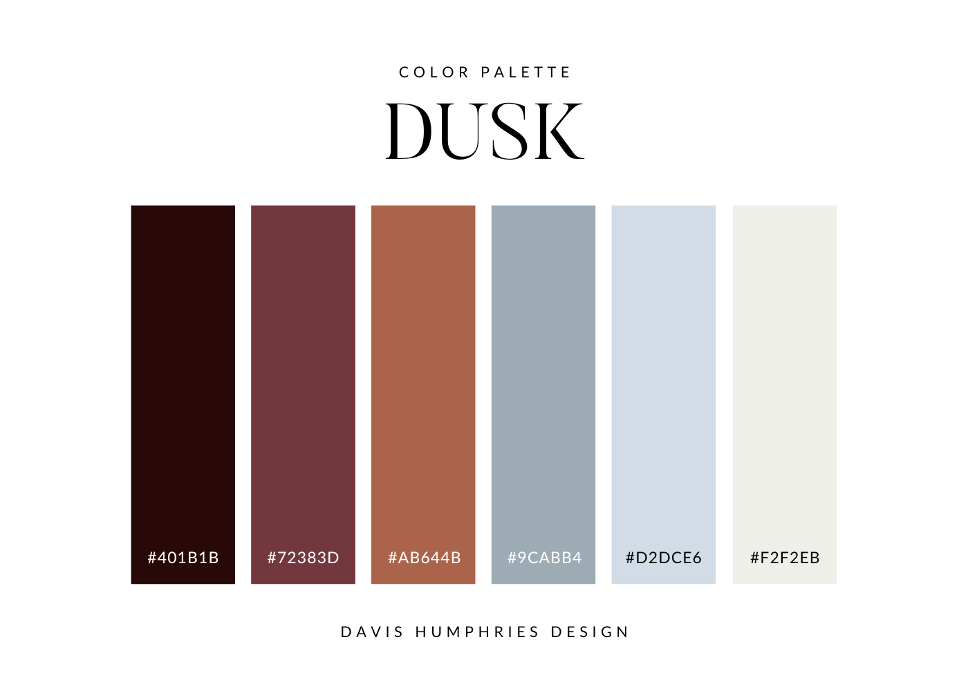
5. Dusk Color Palette
This Dusk Palette is a complementary color scheme with calming shades of blue lending a bold contrast to the deep, rich orange and red. Blue represents peace, tranquility, and security. Orange is associated with freedom, expression, and creativity. Deep reds provide a feeling of ambition, wealth, and power.
Brand adjectives: deep, moody, bold
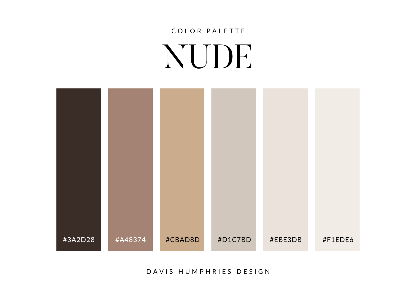
6. Nude Color Palette
This Nude Nalette is a monochromatic color scheme with varying shades of brown. Its tonal simplicity creates a look of neutrality and balance while the color brown lends itself to represent resilience, dependability, security, and safety.
Brand adjectives: minimal, modern, upscale
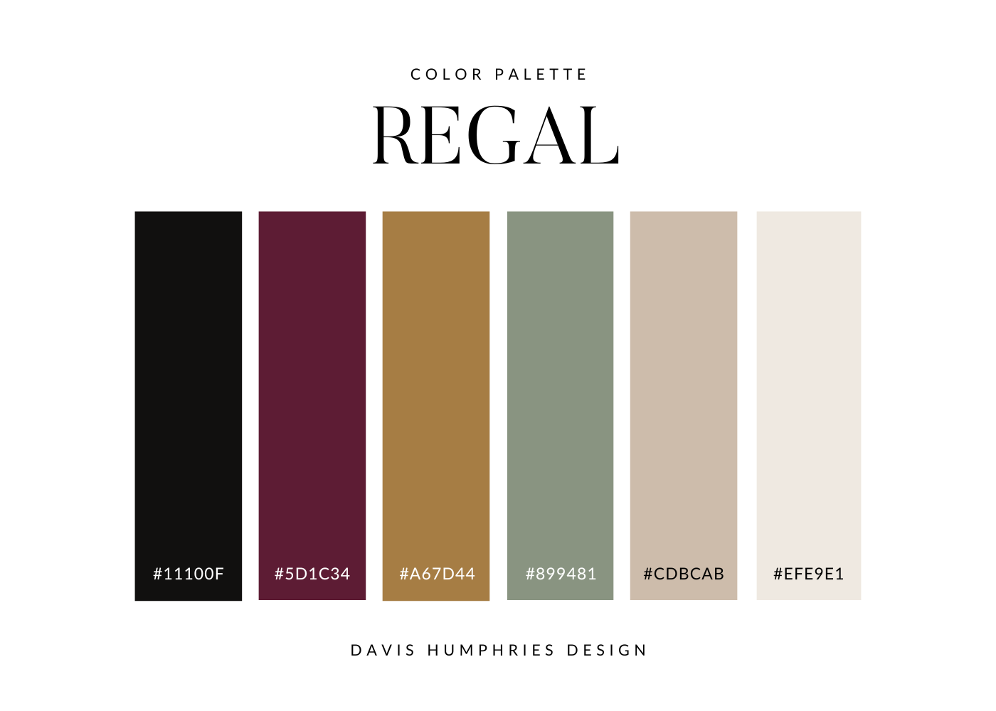
7. Regal Color Palette
This Regal Palette is an analogous color scheme with bold hues of pink, green, gold, and red. The light neutral shades offer a sense of balance and simplicity. The soft sage green provides a hint of freshness and calm. Gold is associated with luxury, success, and fortune. Deep burgundy red represents power and individuality.
Brand adjectives: elegant, earthy, established
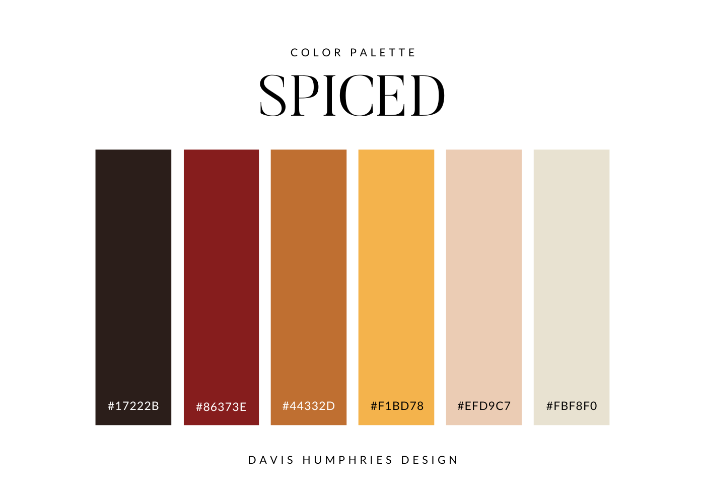
8. Spiced Color Palette
This Spiced Palette is an analogous color scheme with beautifully blended shades of nudish pink, yellow, orange, and red. The peachy pink represents sweetness - it’s pleasant and friendly. The warm saturated yellow stands for happiness, optimism, and creativity. Burnt orange is associated with excitement, security, and adventure. The deep wine red ties it all together with a feeling of health, vibrancy, and courage.
Brand adjectives: bold, actionable, vibrant
9. Luxe Color Palette
This Luxe Palette is almost a minimalist color palette with neutral shades of brown and a bold, sophisticated accent of deep wine red. Brown is often associated with dependability, security, and safety. Red adds a sense of stimulation, energy, and intensity.
Brand adjectives: subtle, sophisticated, upscale

10. Hazy Color Palette
This Hazy Palette is a unique color palette with varying shades of greenish, greyish blue (in case you were wondering what the official scientific terminology was). The fresh mint color represents tranquility, health, and good luck. The lighter shades offer a neutral base while the deep turquoise offers a subtle blend of the tranquility of blue, the growth of green, and the vitality of yellow.
Brand adjectives: fresh, clean, playful

You Might Also Like…


